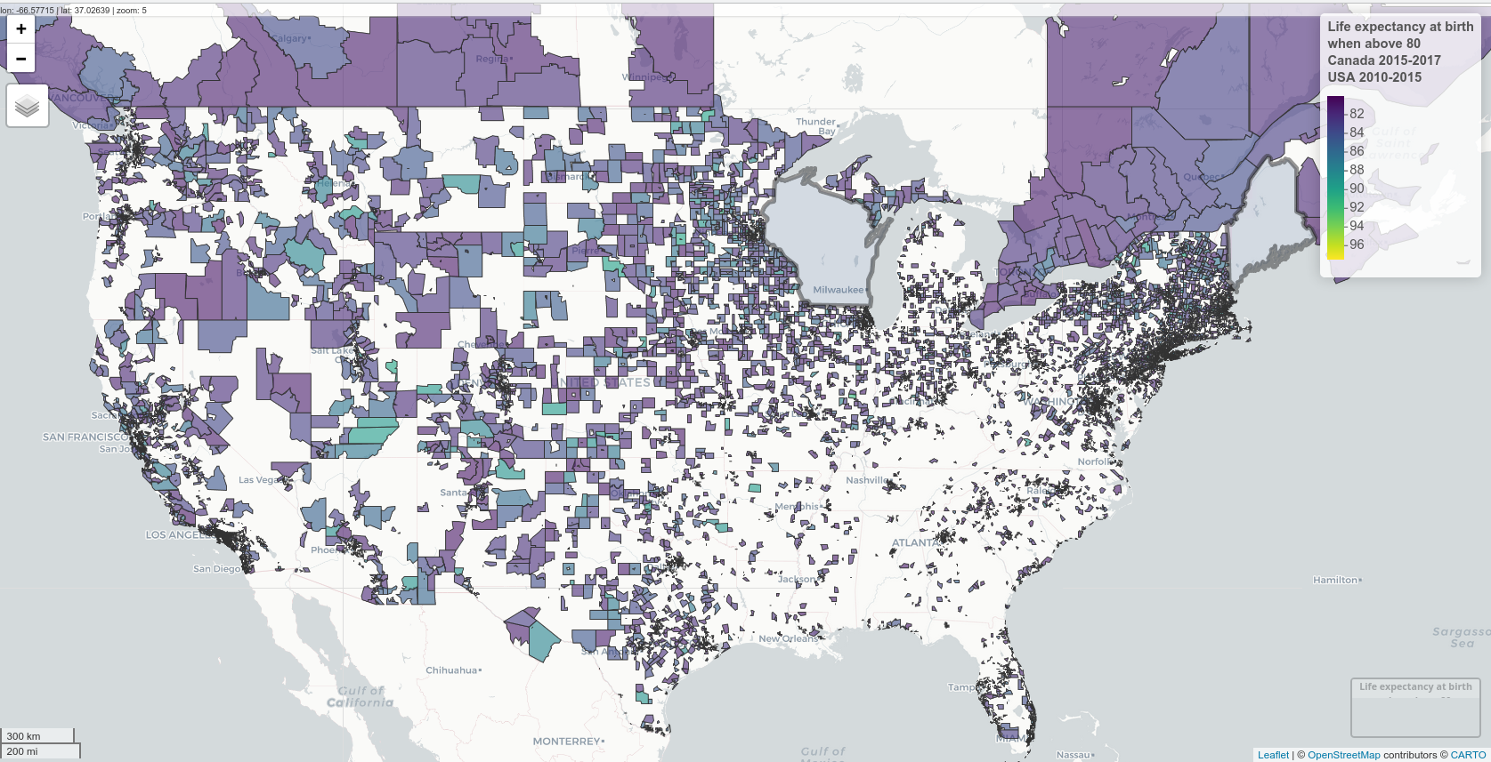
I found life expectancy at birth data for “health regions” in Canada for 2015-2017 and in “census tracts” in the USA for 2010-2015.
Here is a map of these two countries, excluding areas with a life expectancy at birth lower than 0.
Data sources and shapefiles: Canada mortality. Canada shapefiles. USA mortality. USA shapefiles downloaded using the tigris package. Libraries The usual data wrangling libraries for spatial data (tidyverse, sf), mapped using mapview and leaflet.